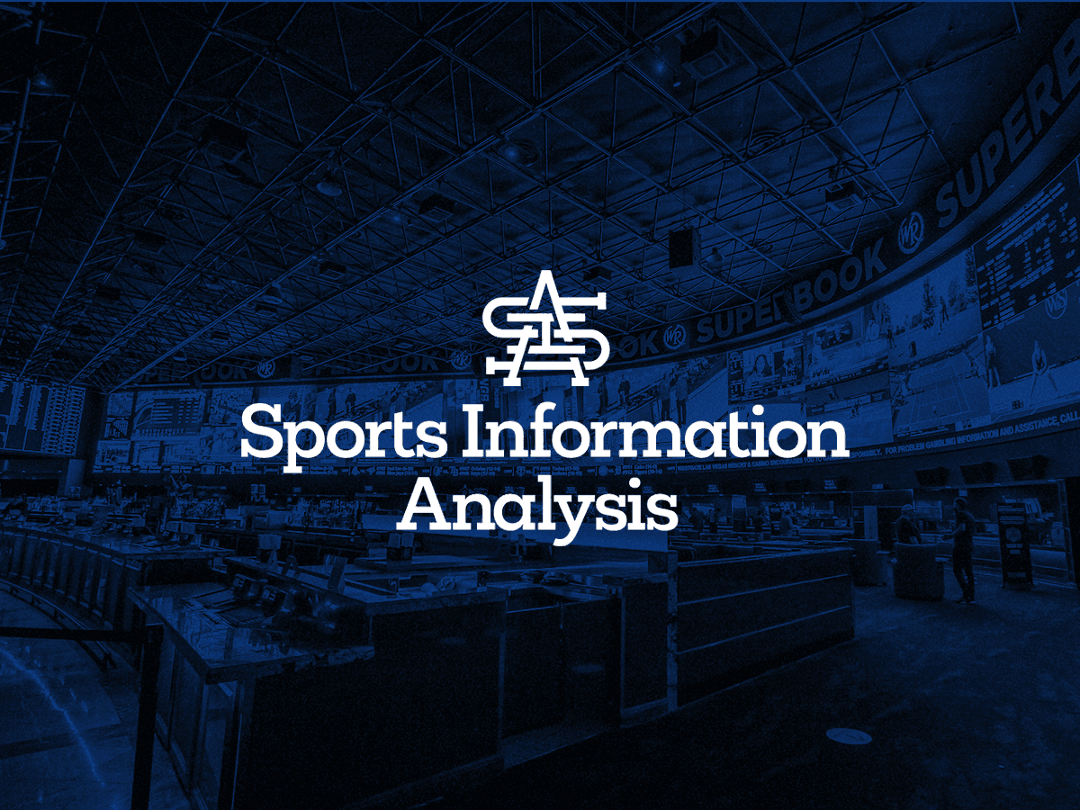
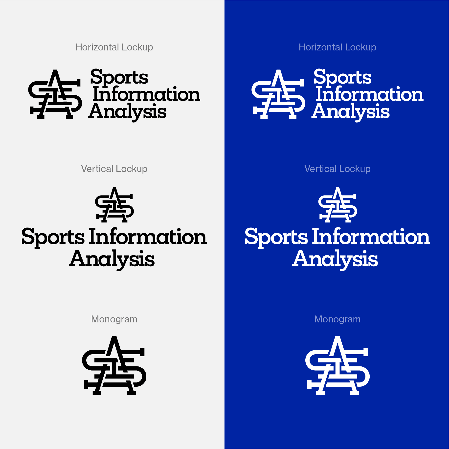
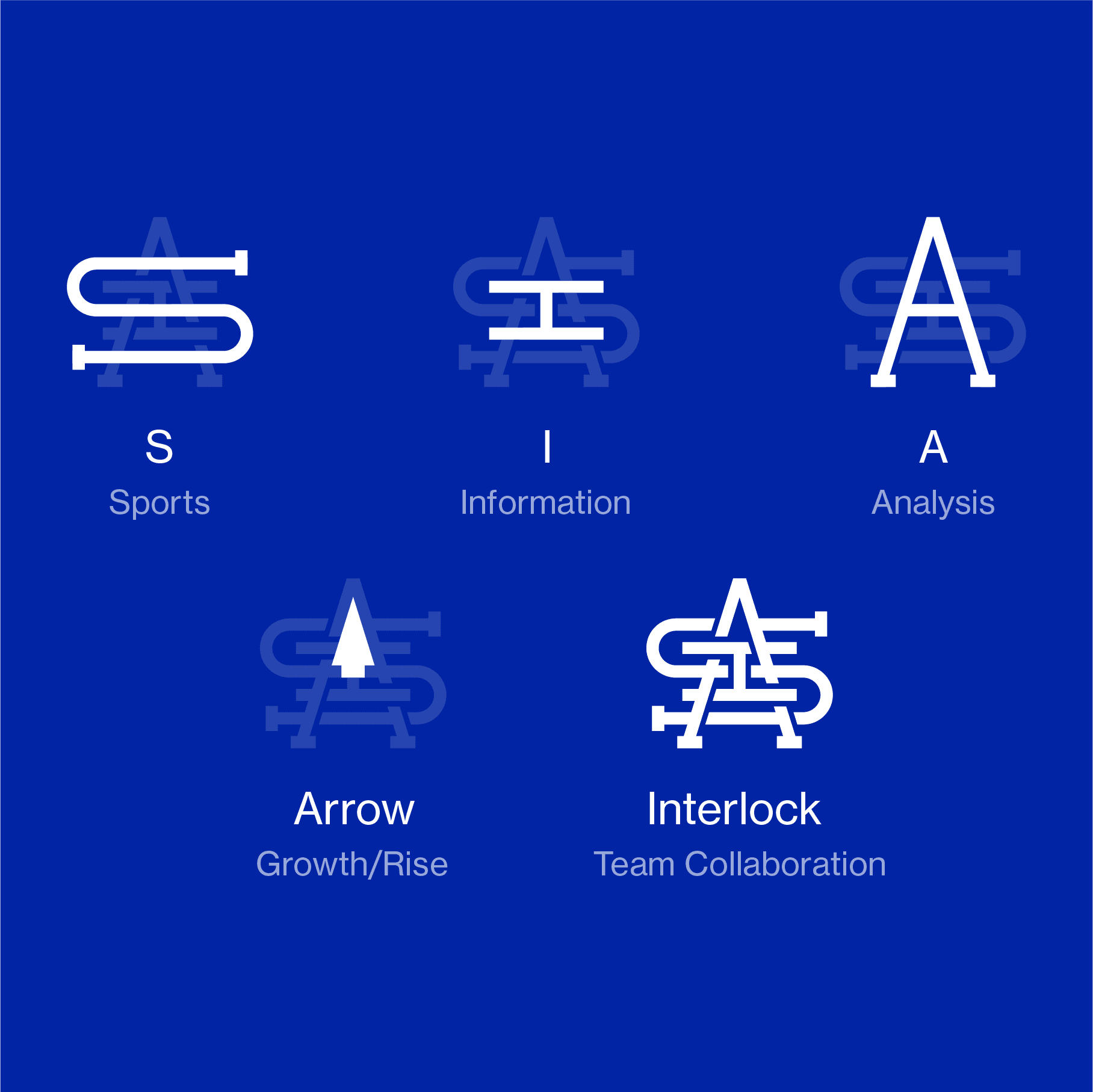
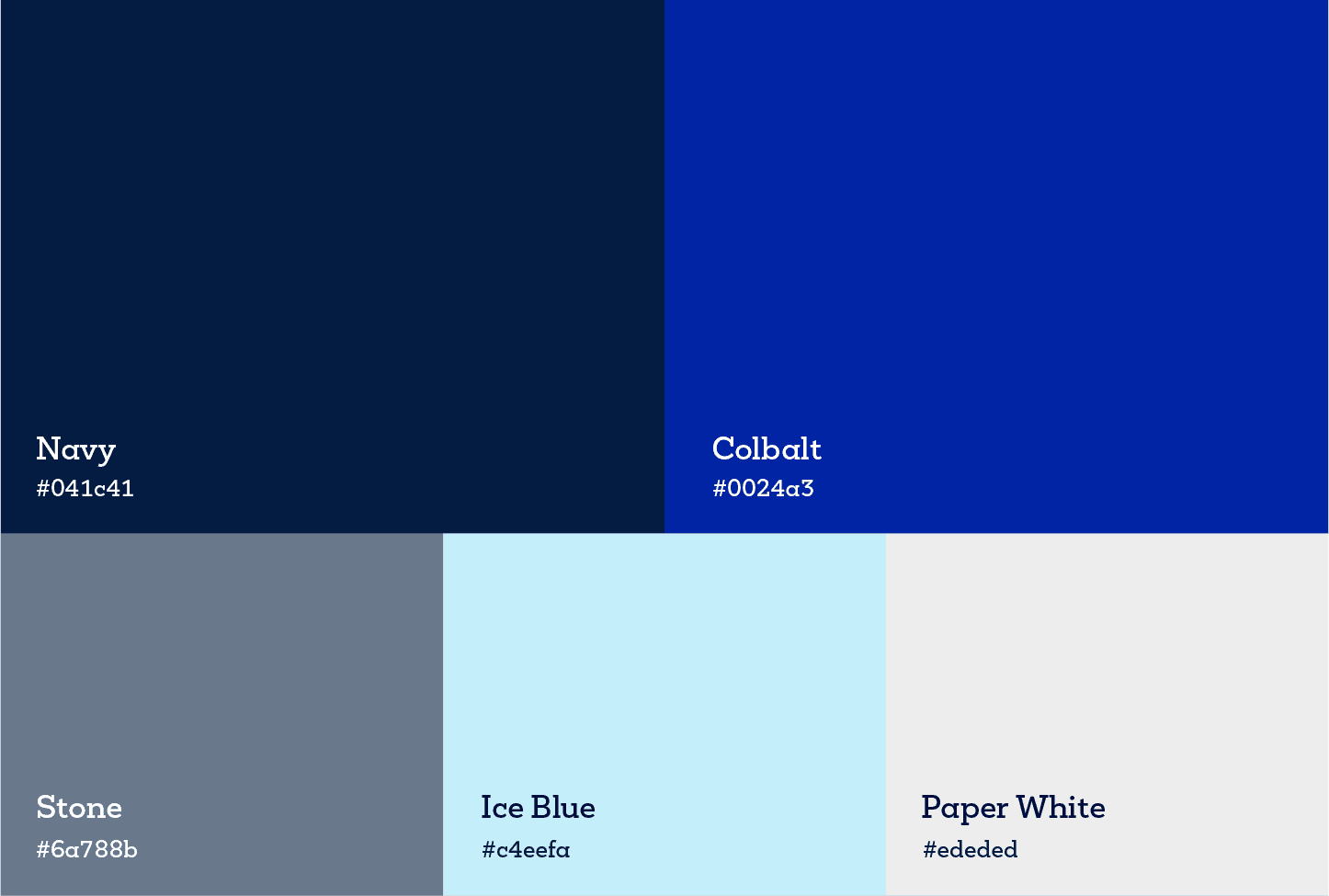
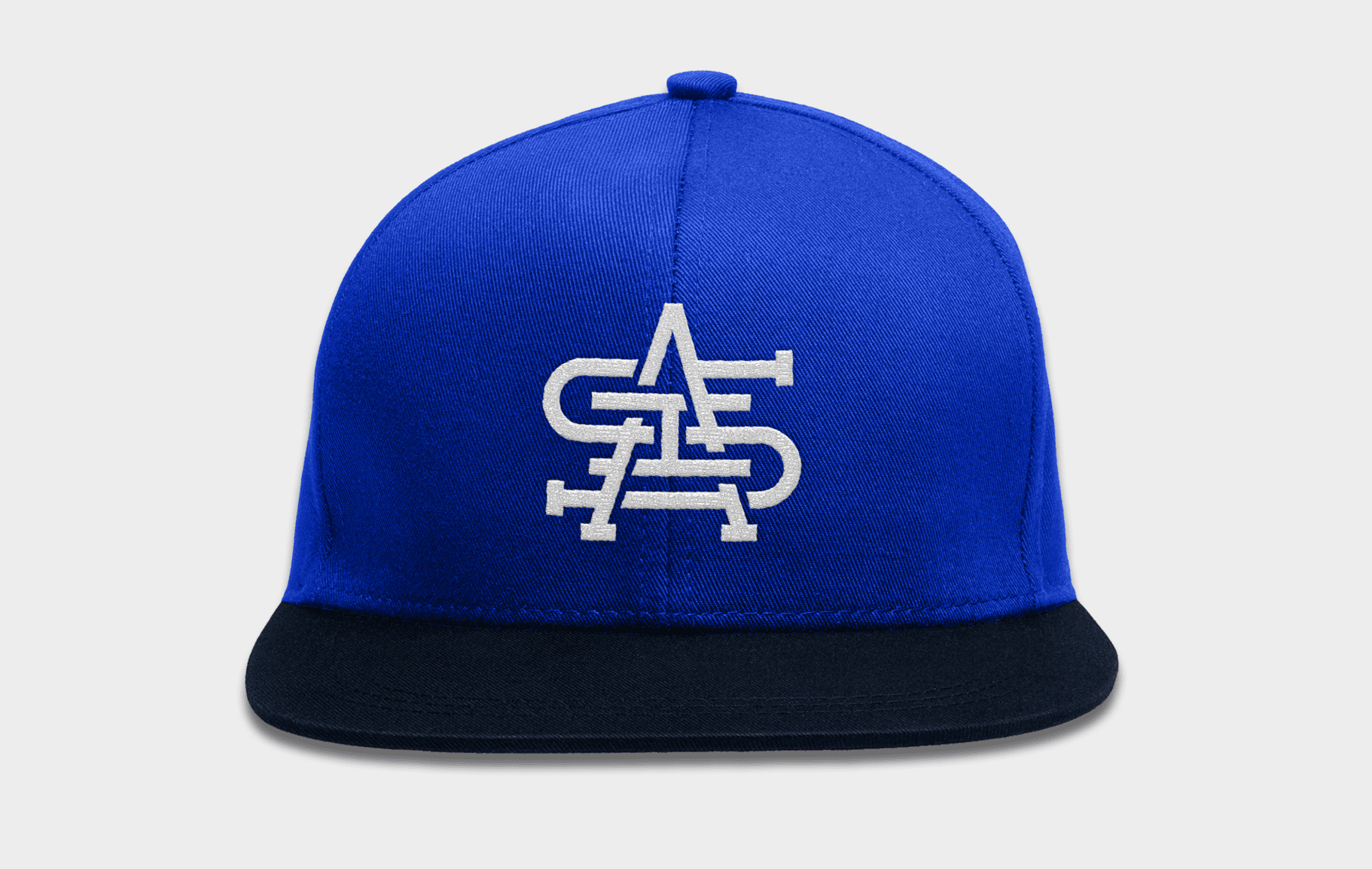
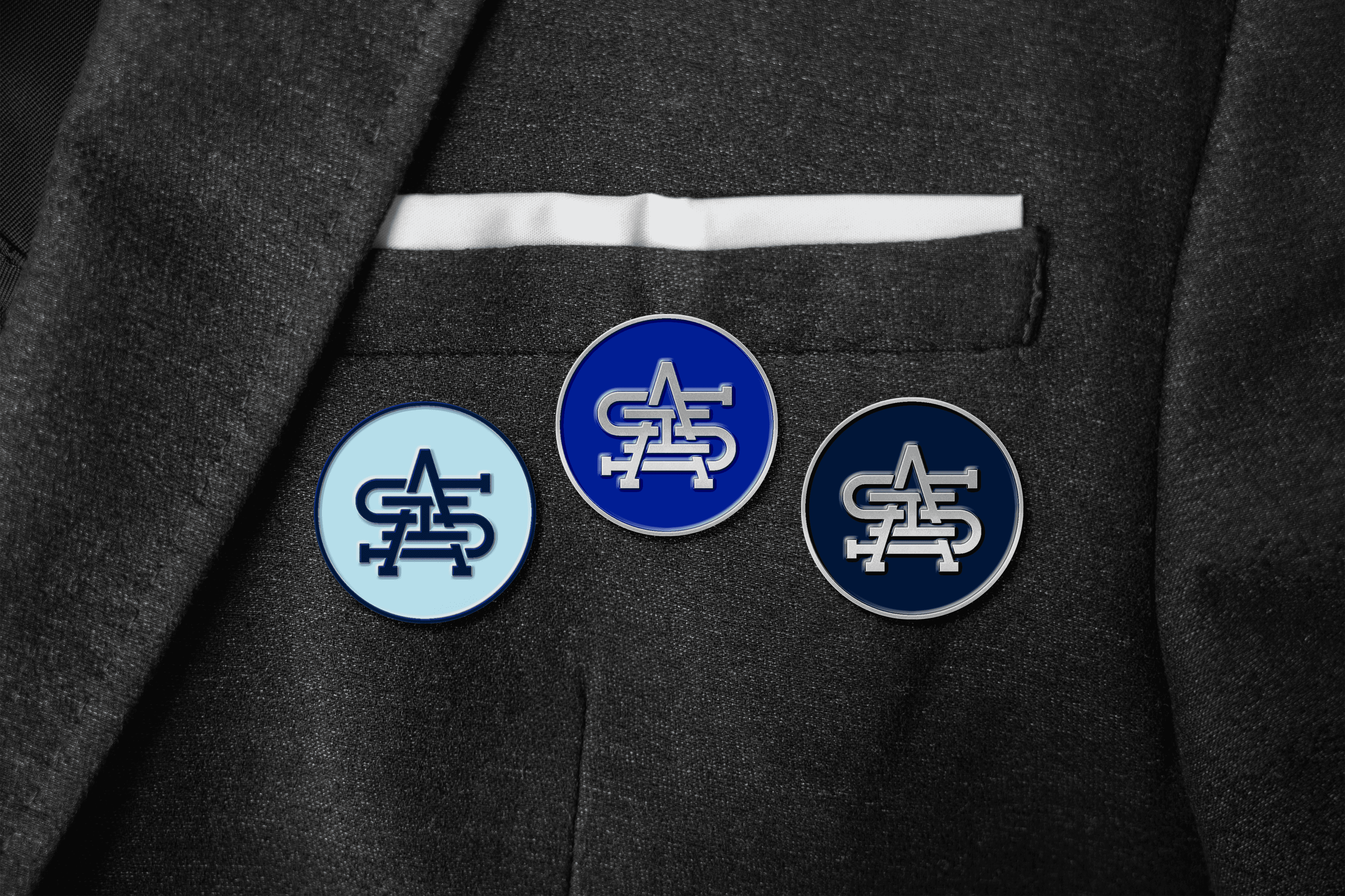
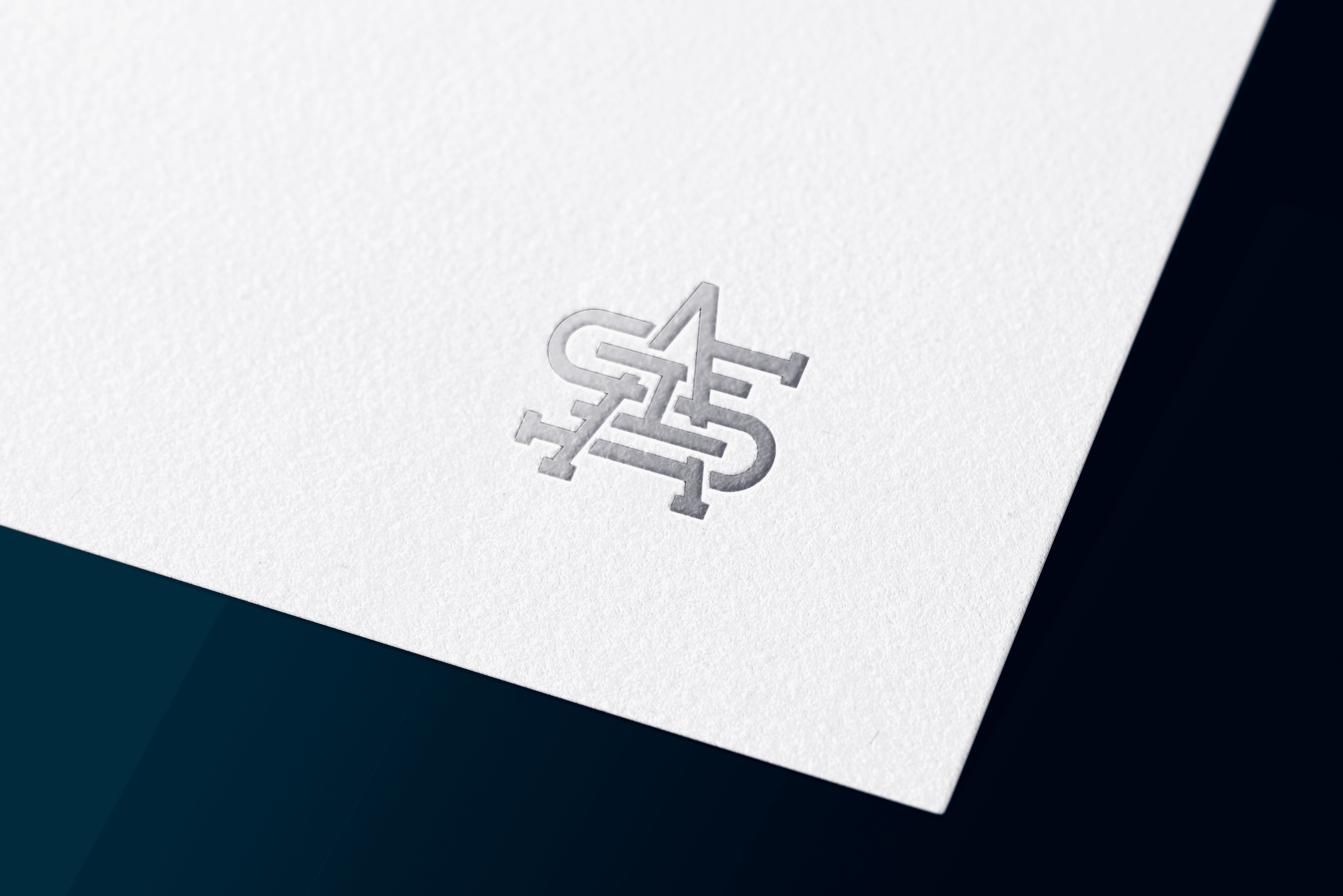
Visual Identity Design
Rebranding Sports Information Analysis
Combining sports and investing into a reimagined brand.
Role
Visual Designer
Client
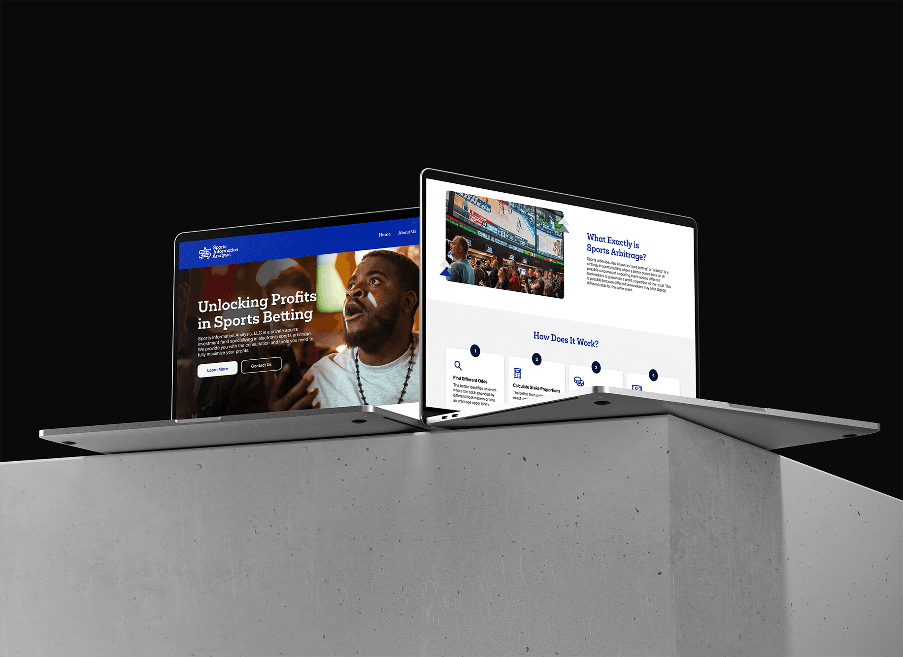
Sports Information Analysis
Industry
Sports Betting
Year
2025

Title


Other projects

Topgolf Multiple Projects
Partnering with Topgolf to strengthen their recruitment and partnership intiatives.

My Cause, My Cleats
Designing a microsite that connects Lions' fans with their favorite players' charities.

DMA Museum Map
Designing a mobile experience that helps visitors find their bearings.

The Standard Move-In 2023
Designing a landing page that organizes important information for students.
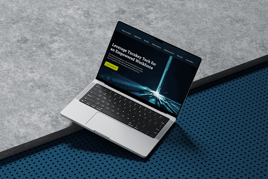
AI as a Service
Transforming a static PDF into an interactive experience

Quadreal Spaces
Creating awareness for an innovative office seat reservation system