UI/UX Design, Interaction Design
The Standard Move-In 2023
Designing a landing page that organizes important information for students.
Role
UI/UX Designer
Client
Landmark Properties
Industry
Property Managment
Year
2023
View Site
Action
Action

Project Overview
Landmark Properties is a property management and development company that owns many real estate buildings in the country, including The Standard in Seattle, Washington. During the summer of 2023, their team reached out to me about creating a landing page that features move-in information for new and returning students for The Standard. They asked that the page be fun and dynamic using the assets that they had created around a funky, 70s theme.

Title
Utilizing Their Brand
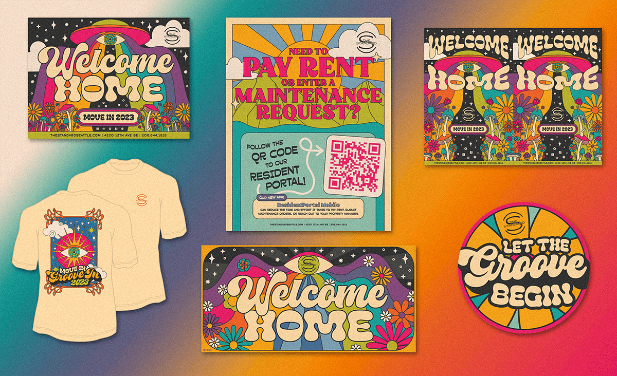
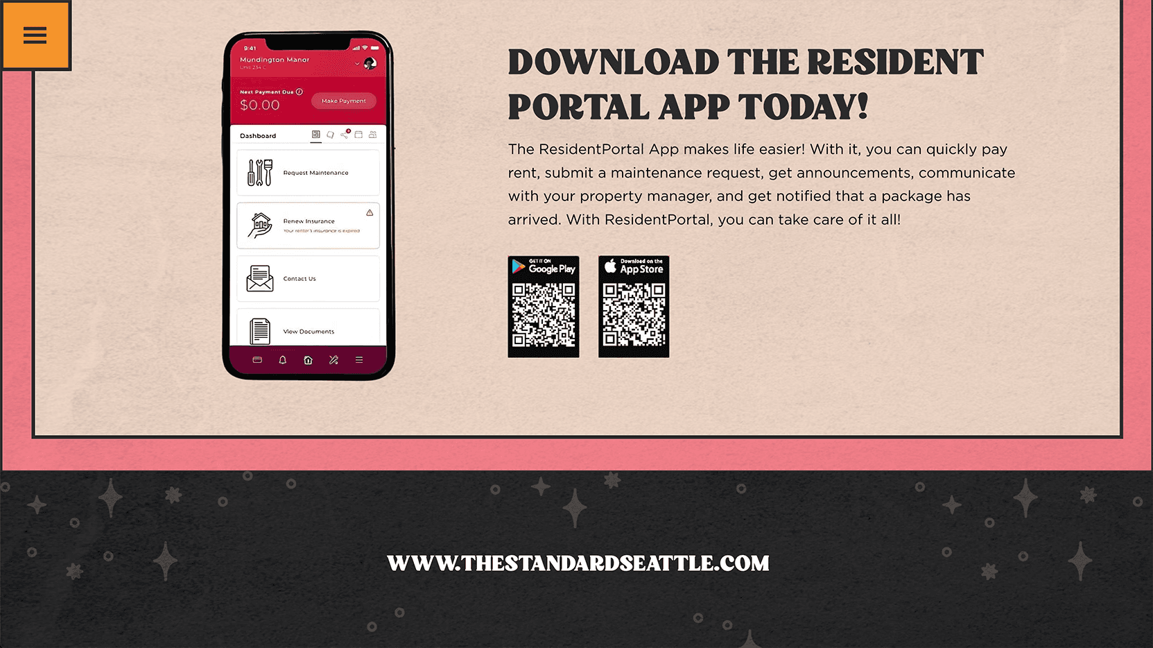
When the stakeholders sent over the 70s theme materials to me, I immediately began to review it. This included social media assets, advertisements, and physical swag, like shirts and pins. While it’s important to understand why and how their assets are used, I was looking for opportunities to add motion to some of their assets since I was creating an interactive experience. I aimed to have those two things keep users engaged and help guide them down the page. Luckily for me, the assets were very fun and vibrant, which allowed me to be really creative with the animations. I also received Illustrator files, which allowed me to go in, dissect the layers, and export all the illustrations I would incorporate into the final design.
Utilizing Their Brand
When the stakeholders sent over the 70s theme materials to me, I immediately began to review it. This included social media assets, advertisements, and physical swag, like shirts and pins. While it’s important to understand why and how their assets are used, I was looking for opportunities to add motion to some of their assets since I was creating an interactive experience. I aimed to have those two things keep users engaged and help guide them down the page. Luckily for me, the assets were very fun and vibrant, which allowed me to be really creative with the animations. I also received Illustrator files, which allowed me to go in, dissect the layers, and export all the illustrations I would incorporate into the final design.
Wireframing the Layout
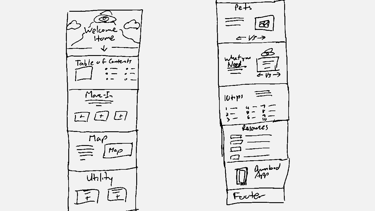
After reviewing the assets, I sketched out a wireframe of how I envisioned the page. The content I received was very dense with text, all of which had to be included since it involved important information for students. My idea involved organizing all the important points into their own section that can be entirely viewed above the fold in plain site as users navigated down the page. In each section, users can click buttons and tile cards to bring up additional content. This helps with loading time and makes the content digestible for users.
Wireframing the Layout
After reviewing the assets, I sketched out a wireframe of how I envisioned the page. The content I received was very dense with text, all of which had to be included since it involved important information for students. My idea involved organizing all the important points into their own section that can be entirely viewed above the fold in plain site as users navigated down the page. In each section, users can click buttons and tile cards to bring up additional content. This helps with loading time and makes the content digestible for users.
Full Design
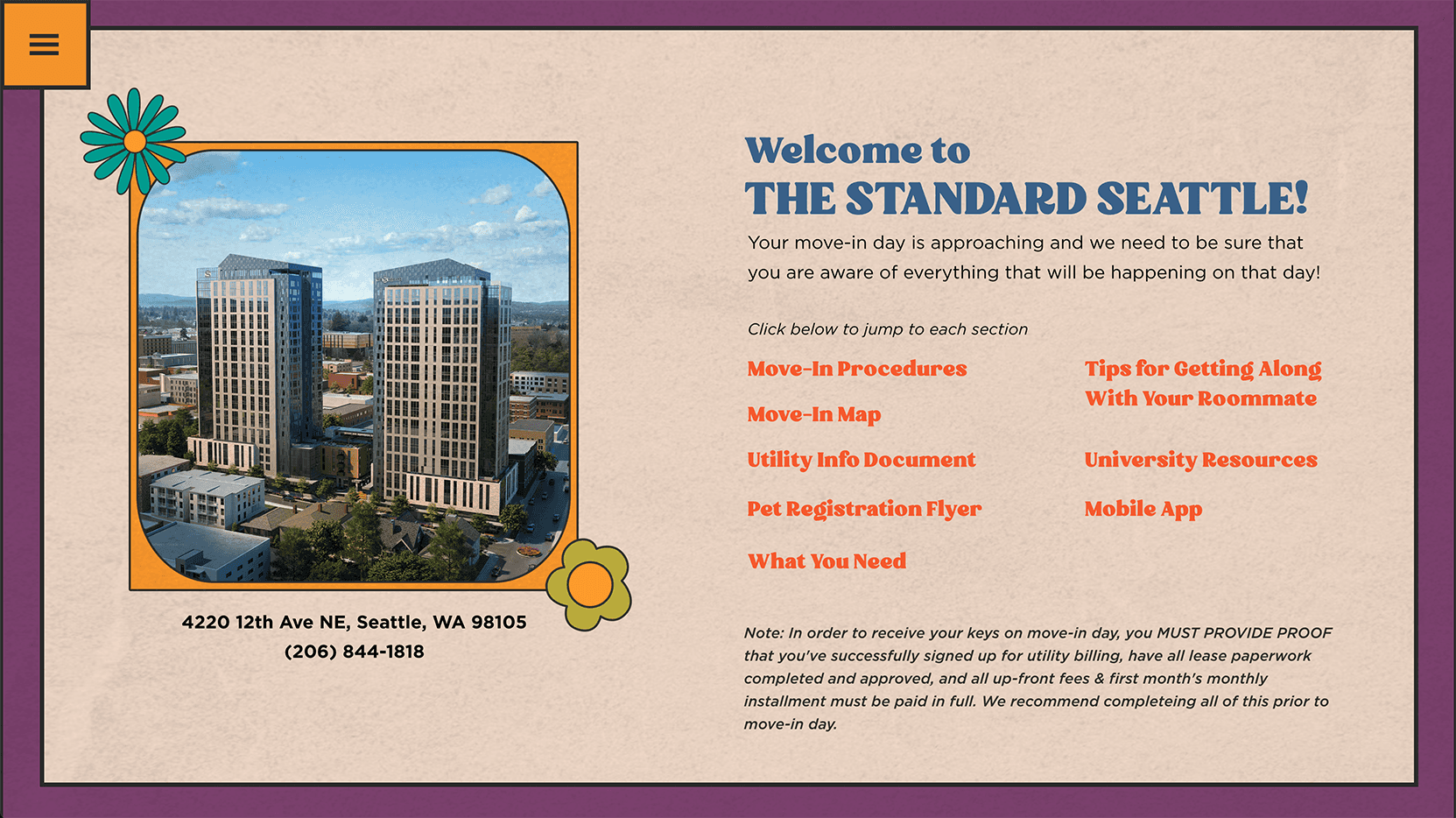
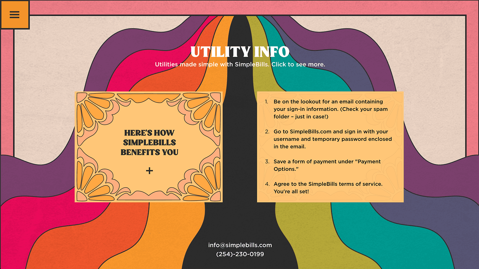
After I presented my wireframe to the team and gained their approval, I began to build out the page. After importing the 70s assets from the original files into landing page, I incorporated animations so that it would add to the fun, groovy theme that Landmark was looking for and help connect back to their printed assets and swag.
Full Design
After I presented my wireframe to the team and gained their approval, I began to build out the page. After importing the 70s assets from the original files into landing page, I incorporated animations so that it would add to the fun, groovy theme that Landmark was looking for and help connect back to their printed assets and swag.


Outcome
Upon completion, I sent over the file to Landmark and they worked with their IT team to implement it onto their website. The reception was positive and students who visited the site complimented both the design and the ease of use. Landmark is currently using the landing page as a template for their yearly student move-in information and is able to easily update the graphics and text to match their current themes or branding.
Other projects

Topgolf Multiple Projects
Partnering with Topgolf to strengthen their recruitment and partnership intiatives.

My Cause, My Cleats
Designing a microsite that connects Lions' fans with their favorite players' charities.

DMA Museum Map
Designing a mobile experience that helps visitors find their bearings.
AI as a Service
Transforming a static PDF into an interactive experience

Quadreal Spaces
Creating awareness for an innovative office seat reservation system